PLEASE NOTE ~ All images are taken from: Milano, Archivio di Stato di Milano, Prefettura di Milano, Gabinetto, Carteggio fino al 1937 – serie I. All images are published with permission of Ministero dei Beni e le Attività Culturali.
Any further reproduction of the images in this article are strictly prohibited.
As we all know, Sports History is a cross-disciplinary field of study, especially with social history. When we think about the links between sports and art, probably we think about photography and painting: how did the artist depict sportsmen and sportswomen of the past? Let’s think then, to the important role of goldsmiths and sculptors in coining medals and creating World Cups, there are so many links to discover. A simple check into the [largely unstudied] sports documents kept at Archivio di Stato [State Archives] in Milan introduces us to an almost hidden world.
One may wonder why sports data is actually kept at the State Archives, in the Prefettura [until 1937] fond. In fact, during the Kingdom of Italy every public sports event had be permitted by the Prefettura ‘prefecture’. Added to this, sometimes organizers liked to appease the authority, inviting the prefect to watch the event and furthermore, they often even pleaded to the Prefect to donate trophies.
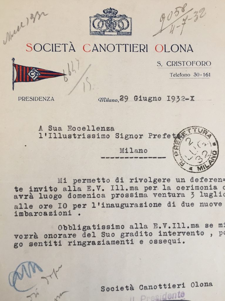
Società Canottieri Olona, 1932, letterhead.
This Milanese rowing club inviting the Prefect to join the public launch of two brand new boats.
Please note the chronology: the letter was sent on June 29th, received on July 2nd [see stamp], answered on July 4th [see handwritten note above, on the right].
Source: f. 1117.
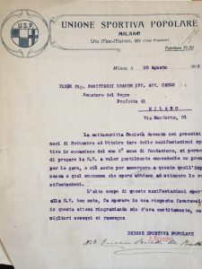
Unione Sportiva Popolare, 1913, letterhead.
This working-class sports society from the outskirts of Milan pleads to the Prefect for the donation of cups for their 2nd anniversary celebrations.
Source: f. 1122.
One of the most important issues concerning modern sports, as we know, is the role of sports clubs and federations, whose main goal is to organize sports movements and events. These are social clubs, of course, and between the late 19th and 20th centuries, these clubs used headed notepaper for their official communications. It would be quite wrong to dismiss such elements as unimportant for historical research, these societies tended not to change their printed official headed notepaper, despite a change of address, rather someone would strike out and hand-write the new information, therefore this ephemera is very useful to track the location of the various societies’ headquarters.
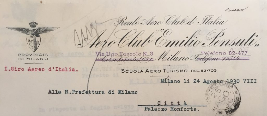
Aero Club Pensuti, 1930, letterhead.
This aviators’ club has changed both the address, from Corso Venezia 69 to Via Ugo Foscolo 3 and the phone number [from 71-544 to 82-477]
Source: f. 398
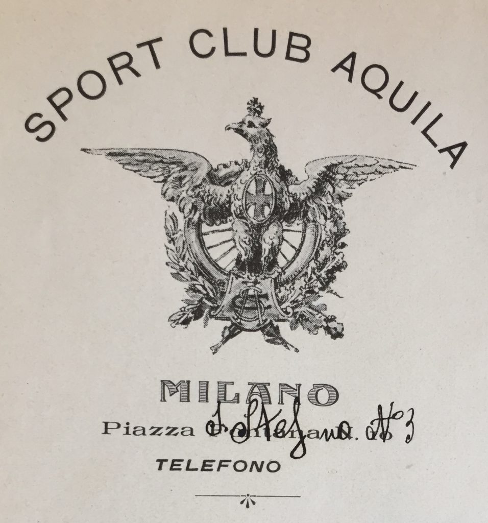
Sport Club Aquila, 1911, letterhead. Note the change of address.
Source: f. 1122.

FC Internazionale, 1918, letterhead.
In 1918, the “neroazzurri” of FC Inter football club where located at Ristorante Vergani, in Via S. Margherita.
Source: f. 1116
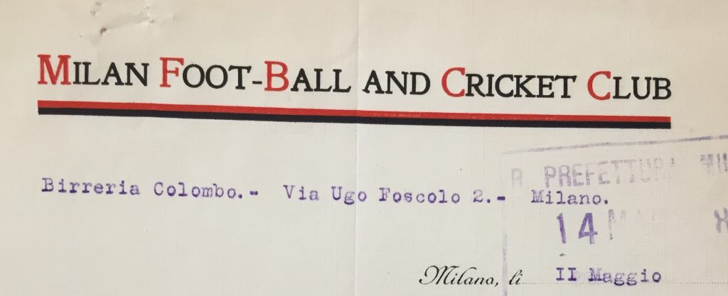
Milan Football and Cricket Club, 1918, letterhead.
If their “neroazzurri” opponents’ headquarters were located at a restaurant, the “rossoneri” ’s ones were at an ale-house, the Birreria Colombo.
Please note the old name of the club, in which the English roots [“Football and Cricket”] can be seen: in 1936 it was changed into “Associazione Sportiva Milan”.
Source: f. 1116.
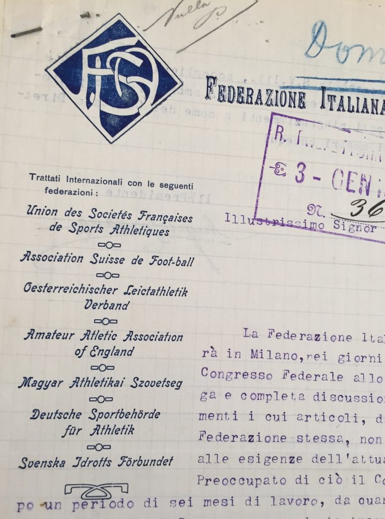
Federazione Italiana Sports Atletici, 1913, letterhead.
Note the several affiliation of this Italian athletics federation
Source: f. 1114.
-
Unione Sportiva Abbiatense [gymnastics], 1929, letterhead.
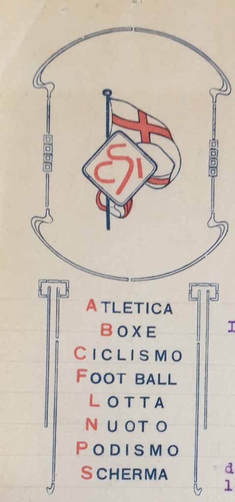
Note beneath the logo, the whole list of all disciplines offered by this sports club, located in Abbiategrasso!
Source: f. 1123.2.
-
Sport Club Italia, 1914, letterhead.
Source: f. 1122.

FC Internazionale original logo [1908]
Source: Wikipedia [https://upload.wikimedia.org/wikipedia/it/9/9a/Stemma_Inter_1908_a_Colori.svg ].
Letterheads contain not only writing, but also include graphics, and above all images. Sports logos are the main visual key that give a clear brand identification to a sports society.
Within a logo, letters themselves became visual elements, as everyone knows, thanks to the renowned FC Internazionale logo, created in 1908 by Italian illustrator Giorgio Muggiani, but this stylish Muggiani monogram was just one among many, in the city.
-
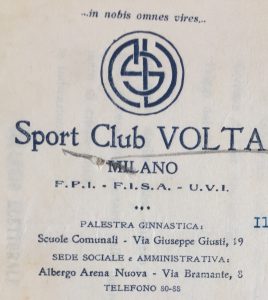
Sport Club Volta, 1922, letterhead.
Note the letters S, C and V.
Source: f. 1122.
-
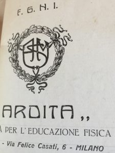
Ardita [gymnastics], 1922, letterhead.
Note the letters A, S and M.
Source: f. 1122.
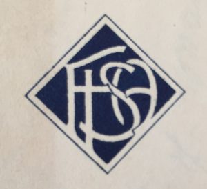
Federazione Italiana Sports Atletici [athletics], 1921, letterhead.
Note the letters F, I, S and A.
Source: f. 1114
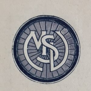
Società Velocipedistica Milanese, 1914, letterhead.
Note how the letters S, V and M are integrated with a bicycle/velocipede wheel.
Source: f. 1122.
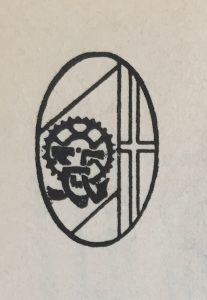
Sport Club Genova, 1927, letterhead.
Note the letters S, C and G, St. George’s Cross and chain ring [Sport Club Genova was a cycling club too].
Source: 1116.
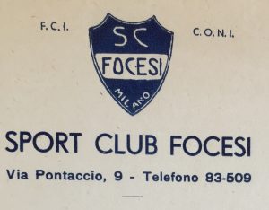
Sport Club Focesi, 1935, letterhead.
Source: f. 1122.

Sport Iris Milan, 1924, letterhead.
Source: f. 1122
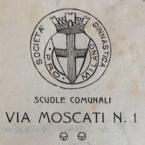
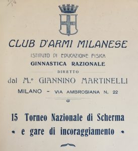
Being Milanese societies, the most common visual element in these logos was the St. George’s Cross, the traditional city flag, it was also the Municipality of Milan symbol, sometimes it featured a towered crown.
-
Società Ginnastica Pro Milano [gymnastic], 1912, letterhead.
Source: f. 1123.1.
-
Club D’Armi Milanese [fencing], 1914, letterhead.
Source: f. 1117.
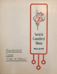
Società Canottieri Olona [rowing], 1912, printed matter.
Source: f. 21

Forza e coraggio, 1934, letterhead.
[Read more details of this society in a previous PP article: https://bit.ly/2RgfZve ]
Source: f. 1122.
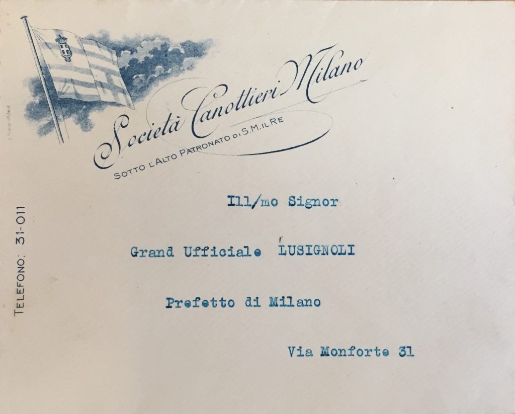
Società Canottieri Milano, 1920, printed envelope
Source: f. 1117.

US Milanese, 1914, carta intestata.
This football team was forced to merge with FC Internazionale in 1928 by the Fascist regime.
Source: f. 1122.
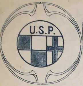
Unione Sportiva Popolare, 1913, letterhead.
Source: f. 1122.
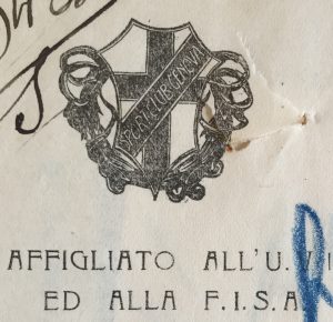
Sport Club Genova, 1913, letterhead.
Source: f. 1122.
Another Milanese element linked to the city’s history is the biscione ‘serpent’, the symbol of the House of Visconti, which was often combined with St. George’s Cross.
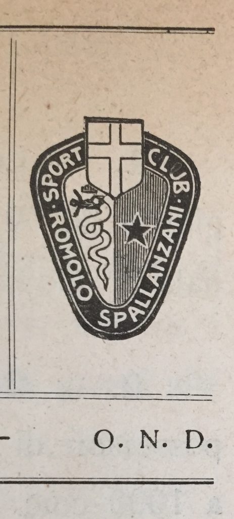
Sport Club Romolo Spallanzani, 1930, printed matter.
Source: f. 1118.2.
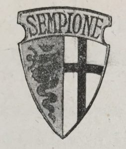
Società Ginnastica e Atletica Sempione [gymnastics and athletics], 1925, printed matter.
Source: f. 1122.
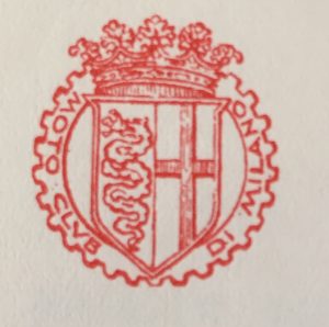
Moto Club di Milano, 1931, letterhead.
Source: f. 1118.2.
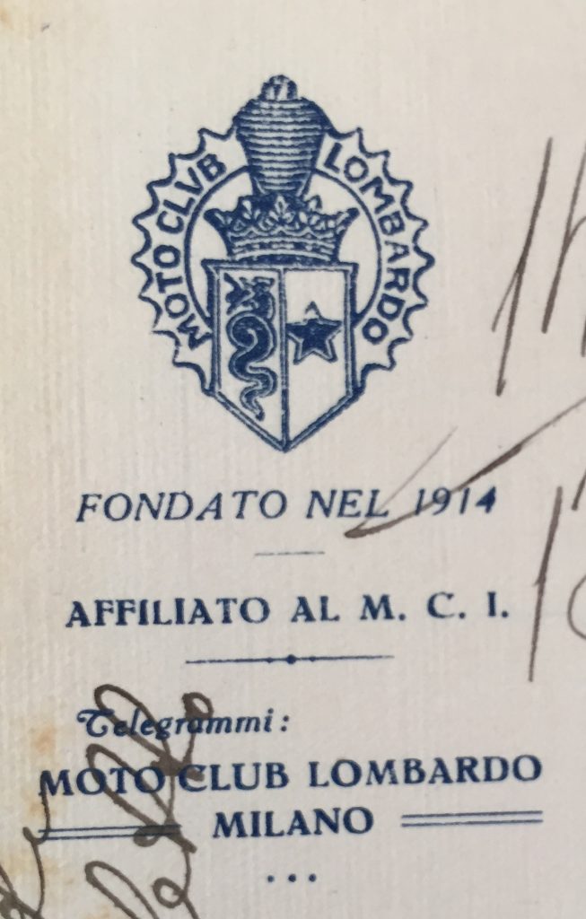
Moto Club Lombardo, 1927, letterhead. The “biscione” is combined with a motorcycle spark plug.
Source: f. 1118.2.
A lot of logos, of course, contain the specific sporting equipment.
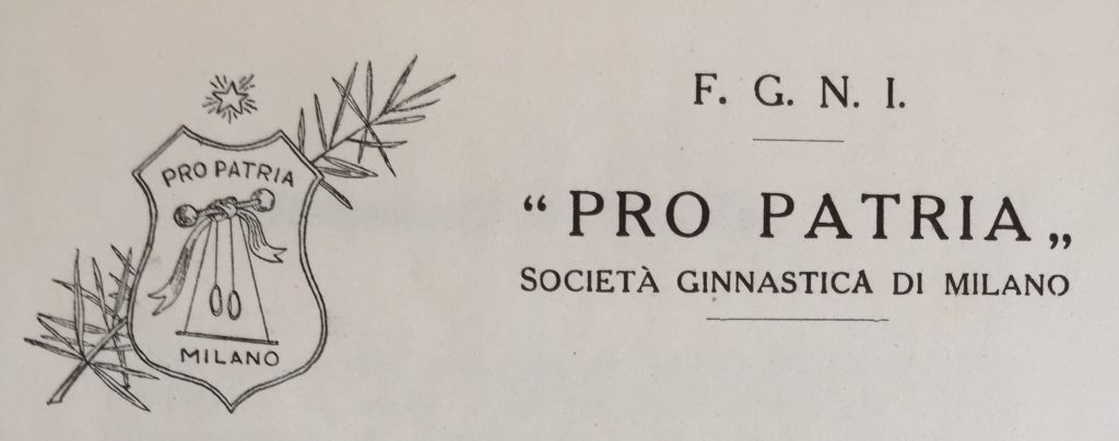
Società Ginnastica Pro Patria, 1923, printed matter.
Note the gymnastics equipment such as “manubri” [dumb bells] and stationery rings. [Thanks to Deborah Guazzoni, SISS, for the interpretation of manubri]
Source: f. 1122.
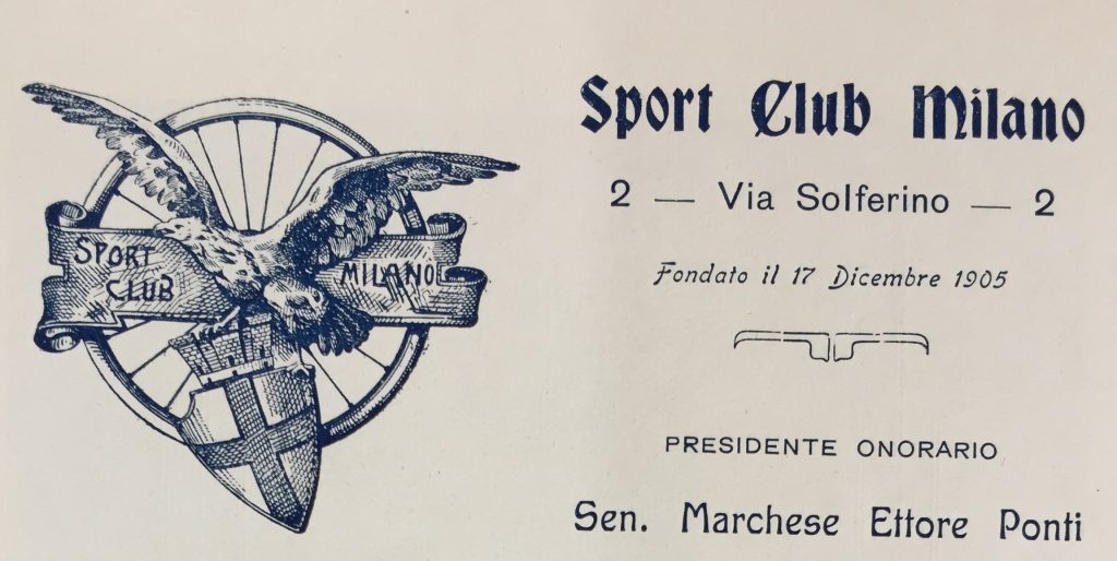
Sport Club Milano, 1910, printed matter.
Note the cycle wheel.
Source: f. 1122.
Società Palazzo del Ghiaccio [ice skating], 1932, letterhead.
Note the ice skate.
Source: f. 1114.
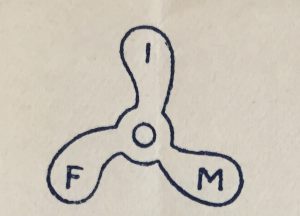
Federazione Italiana Motonautica [motoboating], 1928, letterhead.
Note the propeller.
Source: f. 1117.
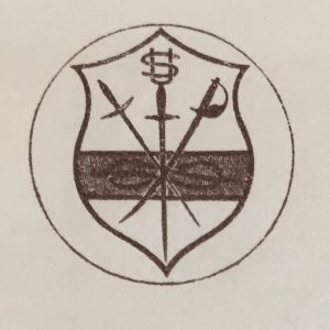
Unione Schermistica Milanese, 1927, letterhead.
Note the crossed épée, foil and the sabre.
Source: f. 1117.
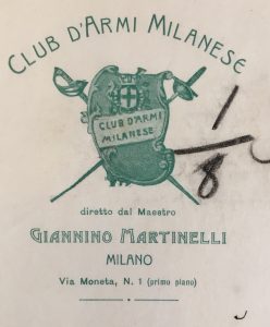
Club d’Armi Milanese [fencing], 1906, letterhead. Note the crossed épée and the sabre. Source: f. 1117.
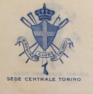
Reale Rowing Club Italiano, 1912, letterhead.
Note the blades, the hook and the helm.
Source: f. 21.
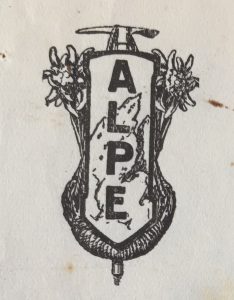
Associazione Lavoratori Pro Escursionismo [hiking], 1935, letterhead.
Note the ice axe.
Source: f. 1115.

Federazione Scacchistica Italiana [chess], 1926, printed matter.
Note the chessboard.
Source: f. 1118.
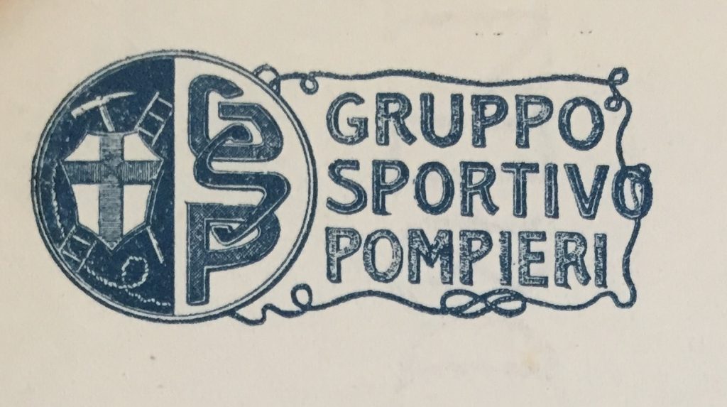
Gruppo Sportivo Pompieri, 1932, letterhead.
Note the rope, the ladder and the axe.
Source: f. 1114.
Wings were common visual elements in racing sports, such as cycling, auto and motorcycle racing:
Società Ciclistica Sport Milano, 1912, letterhead.
Source: f. 1122.
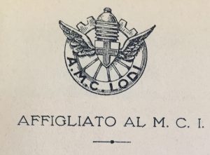
Auto Moto Club Lodi, 1931, letterhead.
Note the car and motorcycle elements: spark plug, wheel, cogwheel.
Source: f. 1118.2.
Sometimes a logo depicts not only equipment, but also the sporting setting, such as these from a number of hiking societies:
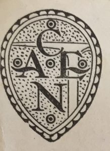
Confederazione Alpinistica ed Escursionistica Nazionale, undated, letterhead
Note the ice-axe.
Source: f. 1115.
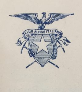
Club Alpino Italiano, 1914, printed matter.
Note the 2 ice axes, crampons and rope.
Source: f. 1115.
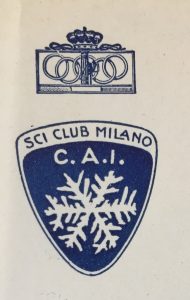
Sci Club Milano, 1935, letterhead.
Here the mountains setting is symbolized by the snow flake.
Source: f. 1115.
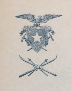
Sci Club Milano, 1931, letterhead. This was the skiing section of the local Club Alpino Italiano. Note the 2 skies and poles. Source: f. 1115.
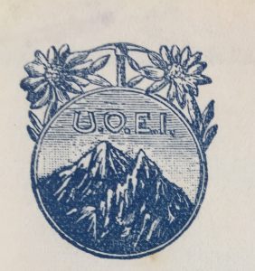
Unione Operai Escursionisti Italiani, 1920, letterhead.
Note the mountains, ice-axe and edelweiss flower.
Source: f. 1115.
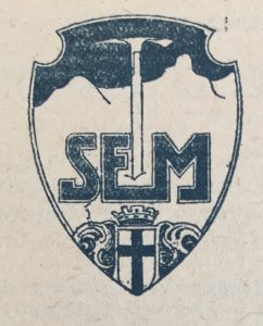
Società Escursionisti Milanesi, undated, letterhead.
Note the ice-axe and the mountains.
Source: f. 1115.
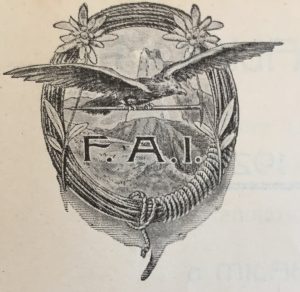
Federazione Alpinistica Italiana, 1924, letterhead.
Note the rope and the edelweiss flowers on the contour; inside the shield, the mountains and a flying eagle carrying an ice-axe.
Source: f. 1115.
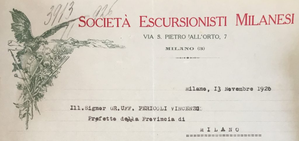
Società Escursionisti Milanesi, 1926, letterhead.
Such a living scene, full of elements! The ubiquitous eagle, several Alpine flowers [not only edelweiss], ice axes and skis, mountains rescue snow stick, rope.
Source: f. 1115.

Ski Club Milano, 1912, letterhead.
Source: f. 1118.
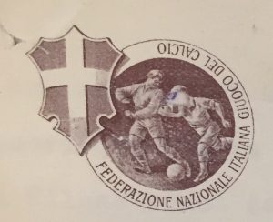
Federazione Nazionale Italiana Giuoco del Calcio [football], 1918, letterhead.
Source: f. 1116.
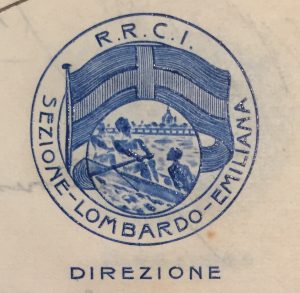
Reale Rowing Club Italiano – sezione Lombardo-Emiliana [rowing], 1912, letterhead.
Source: f. 21.
The logo of the Milanese Palazzo dello Sport ‘Sports Arena’, on the other hand, depict what’s happening outside the building during some sporting events.
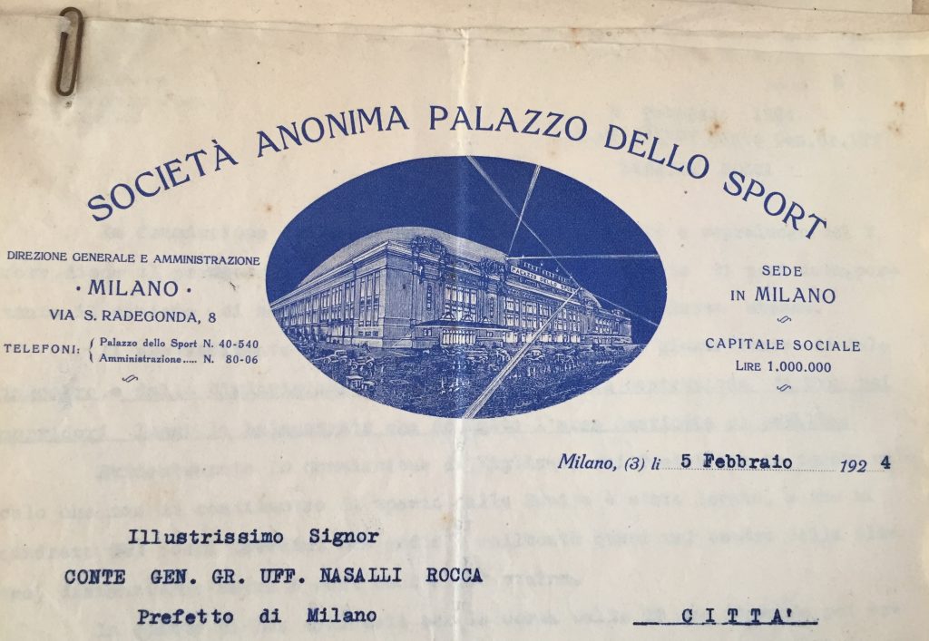
Società Anonima Palazzo dello Sport, 1924, letterhead.
The brand new building, built in just 5 months in 1923, hosted track cycling, boxing and basketball events.
Source: f. 1114.
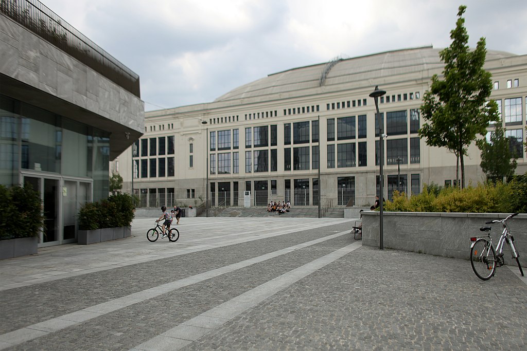
The Palazzo dello Sport today, built as a pavilion of Fiera Campionaria, it is now in the middle of brand new City Life quarter.
Source: Wikipedia [https://bit.ly/2Cw8pbH]
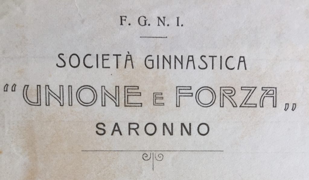
Società Ginnastica Unione e Forza Saronno, 1913, letterhead.
Source: f. 1123.2.
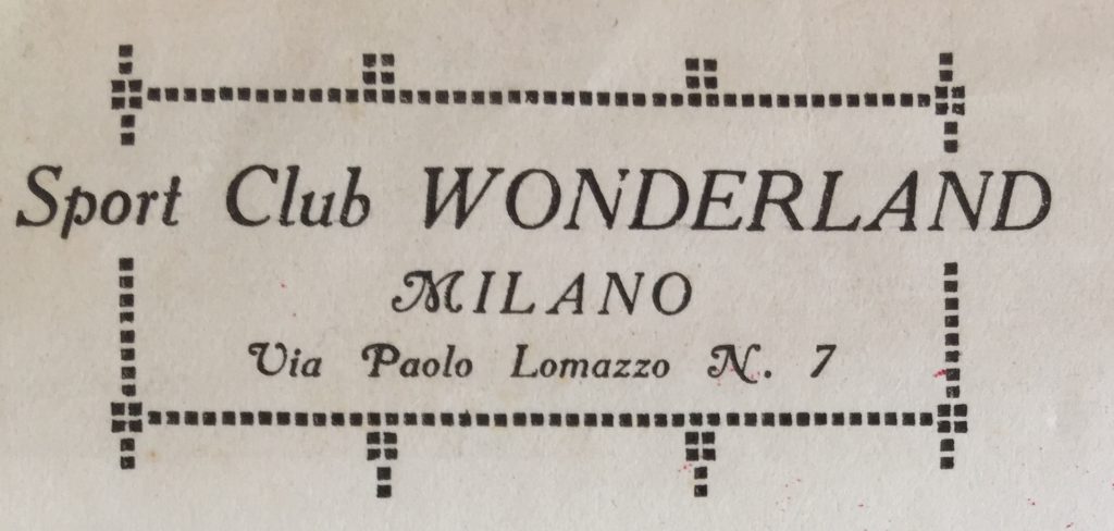
Sport Club Wonderland, 1919, letterhead.
Source: f. 1122.
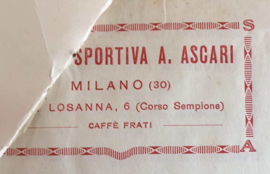
Unione Sportiva A. Ascari, 1925, letterhead.
Note the letters A and S in the corners of the frame.
Source: f. 1122.
Some letterheads use unusual visual elements, such as photographs, or signatures.

Unitas Club, 1908, letterhead.
This picture seems to be the photograph of a real medal.
Note that this is printed not on standard paper, but on paper tissue.
Source: f. 1123.1.
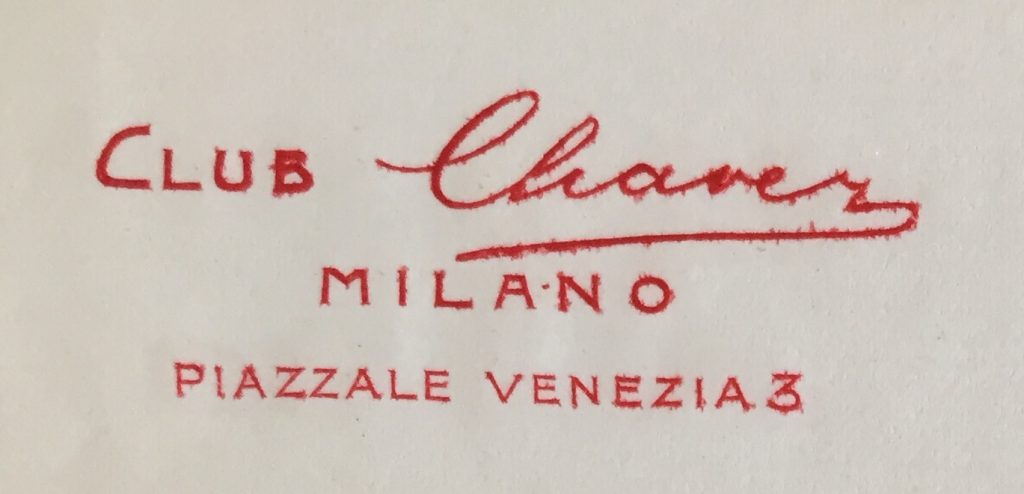
Club Chavez, 1914, letterhead.
This sports club was dedicated to the memory of Jorge Antonio Chávez Dartnell, the Peruvian aviator who firstly crossed the Alps by airplane [1910].
Source: f. 1122
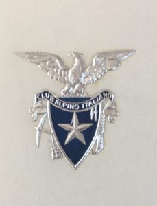
Club Alpino Italiano, 1912, letterhead.
This elegant silver embossed logo was used for the President personal letters.
Source: f. 1115.
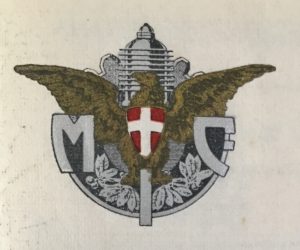
Moto Club d’Italia, 1915, letterhead.
Source: f. 1118.2.
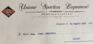
Unione Sportiva Legnanese, 1921, letterhead.
Source: f. 1123.2.
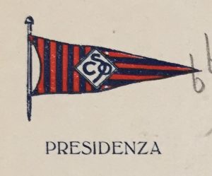
Società Canottieri Olona, 1932, letterhead.
Source: f. 1117.
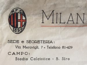
Milan Football Club, 1926, letterhead. Note the different address [headquarters and stadium] Source: f. 1116.
In the last few years before World War I [which began in May 1915, in Italy], logos seemed to flourish, enriched with a lot of visual elements and taking more space on the paper.
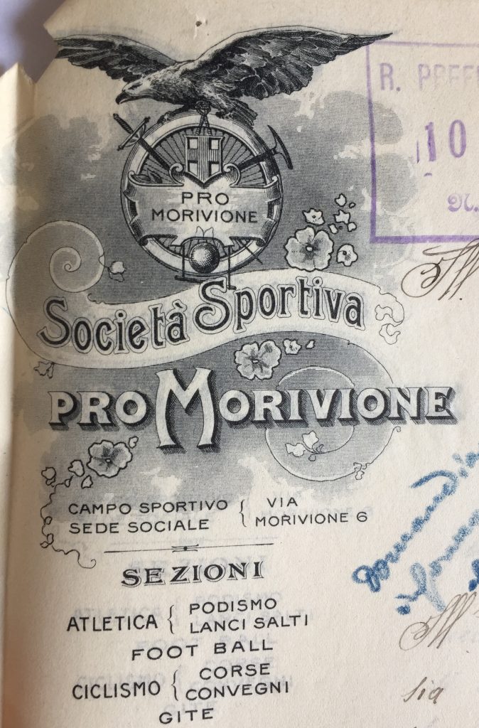
Società Sportiva Pro Morivione, 1914, letterhead.
This logo is a whole sport programme! Note the sporting equipment depicted above the society name with a list of sports underneath: fencing, hiking, athletics [shot put].
Source: f. 1123.1.
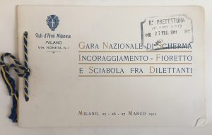
Club d’Armi Milanese, 1911, printed matter
Source: f. 1117.
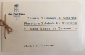
Club d’Armi Milanese, 1912, printed matter
Source: f. 1117.
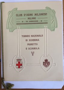
Club d’Armi Milanese, 1913, printed matter
Source: f. 1117.
It is no surprise that during those years Federico Johnson, head of Stefano Johnson mint [which was founded by Stefano’s father, the Englishman James Johnson, in 1830s’], had a lot of work minting sports medals …
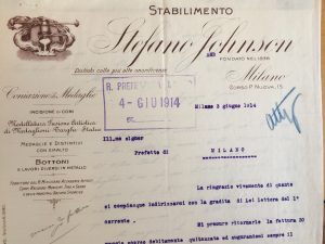
Stefano Johnson, 1914, letterhead.
On the left, the list of products of Johnson’s mint: sports medal, statues, plates
Source: f. 1117.
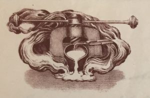
Stefano Johnson, 1914, letterhead.
The company logo, with minting instruments.
Source: f. 1117.
Lastly, what about diachronic change? The swimming society Rari Nantes Milano gives us an example of how logos changed over the years.
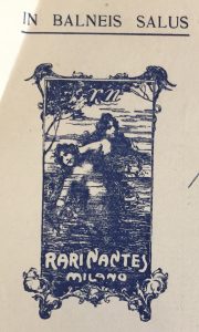
Rari Nantes Milano, 1909, letterhead.
the Liberty-style sirens, and the Latin motto.
Source: f. 1117.

Rari Nantes Milano, 1924, letterhead.
Note the Roman-like plate.
Source: f. 1117.
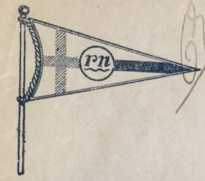
Rari Nantes Milano, 1926, letterhead.
A more stylized logo
Source: f. 1117.
Since the timeline of the images in the archive dates until 1937, and the documents are written to the State Prefecture, it presents a perfect opportunity to observe how the Fascist regime, beginning in 1925, ‘got its hands’ on the whole Italian sports movement, thanks to the Comitato Olimpico Nazionale Italiano [CONI] and the OND [Opera Nazionale Dopolavoro]. The former, once just the Olympic Committee, became the so-called “federation of all the sports federation”,and thanks to which the regime could rule over all the playful sports; the latter ruled over the Dopolavoro [workers’ sports clubs], where the amateur practice was performed. In visual terms, this change can be seen through the emergence of the fascio littorio, within the sports club logo, or inside the CONI or OND.
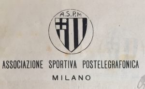
Associazione Sportiva Postelegrafonica, 1920, letterhead.
Note the absence of fascio littorio in this workers’ sports club, the postal and telegraph service workers: it’s only 1920, and the Fascist regime hasn’t started yet.
Source: f. 1122.
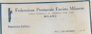
Federazione Provinciale Fascista Milanese, 1924, letterhead.
This was the provincial headquarters of National Fascist Party
Note the fascio littorio, on the left.
Source: f. 1122.
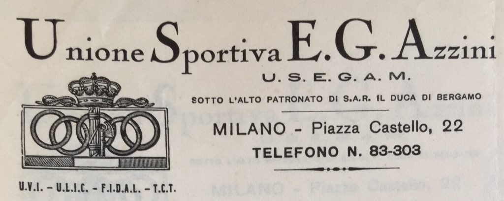
Unione Sportiva E. G. Azzini, 1934, letterhead.
Note the CONI logo with the fascio littorio on the Olympic 5-ringed flag, the Italian flag [below] and the Italian royal crown [above].
Source: f. 112

Società Ginnastica Monzese Forti e Liberi, 1931, printed matter.
On the left, the sports club logo, on the right, the CONI logo with fascio littorio.
In the first, the Iron Crown of Lombardy [which tradition holds to be made of iron beaten out of a nail of the True Cross] as symbol of Monza, since this crown is conserved in the local Cathedral.
Source: f. 1223.2.
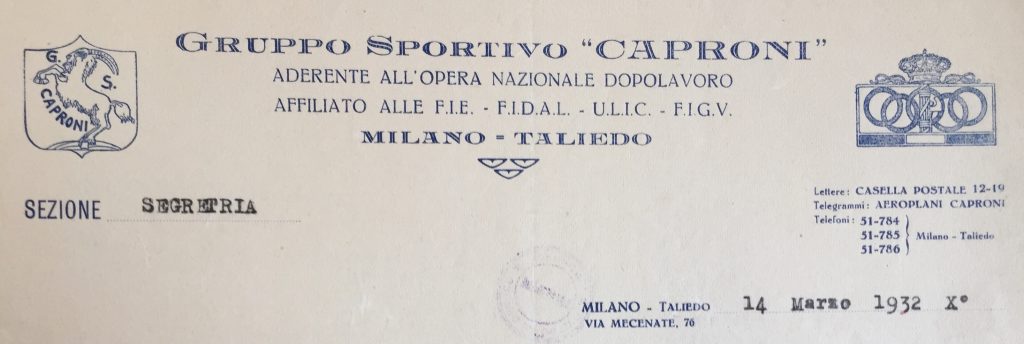
Gruppo Sportivo Caproni, 1934, letterhead.
This is the Dopolavoro to where the athletes of GS Giovinezza transferred in November 1937 [see https://bit.ly/2VFvcs4 ].
The sports club logo has a caprone ‘goat’ on the shield because of the assonance with Caproni family name, which owned the aircraft industry.
As the header says, this Dopolavoro was affiliated not only to OND, but also to some agonistic federation such as FIDAL [athletics]: for this reason, it was also linked with CONI, the logo of which can be seen on the right.
Source: f. 1122.

Associazione Lavoratori Pro Escursionismo [hiking], 1934, letterhead.
On the right, the OND logo.
Source: f. 1115.
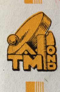
Associazione Tamburellistica Milanese, 1933, carta intestata. Tamburello is a court game that the Fascist regime tried [without success] to spread among male workers as amateur team sports.
Source: f. 1118.
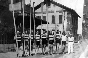
Società Canottieri Milano rowers in front of local Naviglio [canal] [1930]: Note their striped shirt.
Source: Wikipedia [https://bit.ly/2OFoD4T ].
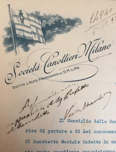
Società Canottieri Milano, 1920, letterhead.
In the first quarter, the Italian royal crown is on the Milanese flag: the club was under the protection of the Italian Crown.
Source: f. 1117.
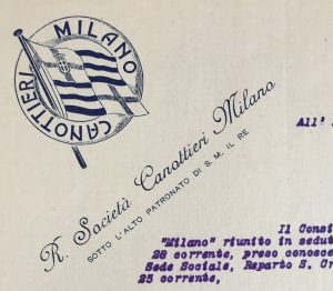
Società Canottieri Milano, 1926, letterhead.
The logo, inside a lifeboat, has no fascio littorio.
Source: f. 1117.
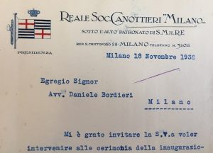
Società Canottieri Milano, 1932, letterhead.
The Italian crown, at the top, the fascio littorio on the left
the so called Italian diarchy [Mussolini had to formally respect the authority of King Vittorio Emanuele III, combining his figure with the king’s one, without replacing it] is up and running.
Source: f. 1117.
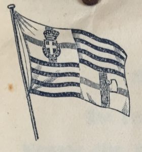
Società Canottieri Milano, 1931, letterhead. The fascio littorio is put in the 4th quarter.
Source: f. 1117.
Article © Marco Giani
For more details about the Sports History funds at the Milan Archivio di Stato, see:
https://www.academia.edu/43667097/Fonti_per_la_storia_dello_sport_nellArchivio_di_Stato_di_Milano

